Quick visualisation of geophysical borehole data
Geophysical well logs: Quick visualisation and interpretation
Among geophysical data, well logs are considered hard data because they contain geophysical measurements of the stratigraphic sequence registered along a wellpath. Well logs are useful to calibrate rock properties derived from seismic data.
The following steps provide a simple way for displaying and processing quickly a set of geophysical well logs. It is also possible to produce report-ready plots and images for student or engineering projects.
Note: I strongly suggest you to use this notebook prior loading and processing logs with any commercial software. As user, you can quickly inspect and QC data, and determine the strategy to follow for processing and integrating data.
Loading and displaying well logs
Generally, geophysical well logs are contained in a LAS format file which contains a header with detailed information about well location, conditions of the terrain, sondes, measured properties, etc. To simplify this notebook and safeguard of sensible information, the header has been removed and data was converted to a CVS format. Therefore, the user must prepare
Data preparation is needed to be able to use some packages. For example, samples without measurements are identified by the number -999.00 in this case, which are converted to NaN for better data handling.
import numpy as np
import pandas as pd
import matplotlib as mpl
import matplotlib.pyplot as plt

%matplotlib inline
# This style makes graphs with a gray background, suitable for screen visualisation
#plt.style.use('ggplot')

# This style makes graphs with a white background, suitable for report or printing  visualisation
plt.style.available

# Set some Pandas options
pd.set_option('display.notebook_repr_html', False)
pd.set_option('display.max_columns', 20)
pd.set_option('display.max_rows', 25)

def valtonan(inp, val=-999.00):
    """Convert all 'val' to NaN's."""
    inp[inp==val] = np.nan
    return inp

#This function makes for cleaner axis plotting
def remove_last(ax, which='upper'):
    """Remove <which> from x-axis of <ax>.
    which: 'upper', 'lower', 'both'
    """
    nbins = len(ax.get_xticklabels())
    ax.xaxis.set_major_locator(mpl.ticker.MaxNLocator(nbins=nbins, prune=which))
#logs = pd.read_csv('well_2.csv')
logs = pd.read_csv('well-log-4.csv')
logs = valtonan(logs)
#Acronyms of the logs contained in this file
logs.columns
Index(['DEPTH', 'GR', 'AT10', 'AT20', 'AT30', 'AT60', 'AT90', 'ATCO90', 'BS',
       'DPO', 'DRH', 'DTCO', 'DTSM', 'HAZI', 'HCGR', 'HDMI', 'HDMX', 'HFK',
       'HSGR', 'HTHO', 'HURA', 'NPHI', 'RB', 'RHOM', 'SDEV', 'SPHI', 'SPN',
       'VPVS'],
      dtype='object')
Not all data contained in the file is of interest. Thus, it is neccesary to know the meaning of the acronyms to chose among them, which should be done by revising the header.
We select the following logs and display some statistical values about the corresponding measurements:
- DEPTH: measured depth
- GR: Gamma Ray
- RHOM: Bulk density
- SPHI: Porosidad computed from the sonic log
- ATCO90: Resistivity of deep penetration
- DTCO: Sonic log or Travel time of compressional wave
- DTSH: Sonic log or Travel time of shear wave
- VPVS: Compresional to Shear Velocity Ratio computed from DTCO and DTSH
#logs[['depth','vp','vs','rho','gr','nphi']].describe()

#Selected curves are measured depth, resistivity, travel time of compressional wave, travel time of shear wave, neutron porosity, Bulk density, porosity from sonic log, self potential, velocity ratio
logs[['DEPTH', 'GR', 'ATCO90', 'DTCO', 'DTSM', 'NPHI', 'RHOM', 'SPHI', 'VPVS']].describe()
             DEPTH           GR       ATCO90         DTCO         DTSM  \
count  6562.000000  6562.000000  6538.000000  6562.000000  6562.000000
mean   4499.991000    41.046896   685.979062    91.948374   180.283343
std     288.711218     6.680273   268.061623    12.022414    42.512737
min    4000.042800    24.178700   181.110300    63.459700   107.827400
25%    4250.016900    35.766075   479.974625    81.721325   142.741450
50%    4499.991000    40.752850   673.078250    89.609150   168.963550
75%    4749.965100    45.989900   873.446025   102.015250   216.431375
max    4999.939200    85.250500  1920.117200   117.777500   275.938800

              NPHI         RHOM         SPHI  VPVS
count  6562.000000  6562.000000  6562.000000   0.0
mean      0.002531     2.406205     0.242077   NaN
std       0.349655     0.488006     0.080958   NaN
min      -0.519400    -2.565200     0.050200   NaN
25%      -0.345775     2.412600     0.173200   NaN
50%       0.255750     2.460300     0.226300   NaN
75%       0.341475     2.499300     0.309900   NaN
max       0.481400     2.632200     0.416000   NaN
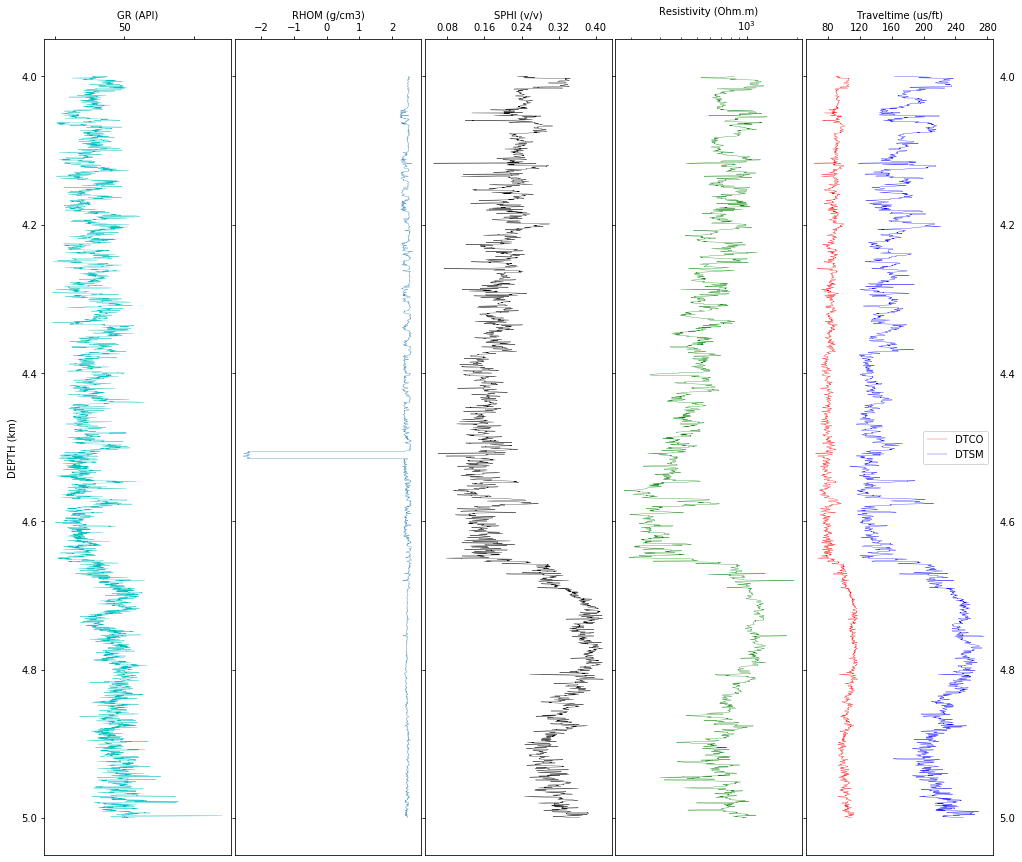
Let’s do some data exploration by plotting raw data. This will give us an idea of noises, interruptions, anomalies, etc., in the data. Depending on the scope of the study, we may focus our analysis in specific intervals of interest but it is always a good idea to see the bigger picture and understanding the possible problems of each log along the entire depth. In this example, we work with in an interval.
From the graph below we can see that the density in the second track has anomalous values that should be filtered out, but most importantly, to find the reason for such unrealistic values. In this case, such negative values appear to coincide with a formation boundary (suggested by the curve deflection of gamma ray) or it can be due to a problem with the instrumentation.
f, (ax1, ax2, ax3, ax4, ax5) = plt.subplots(1, 5, sharey=True, figsize=(17, 15))
f.subplots_adjust(wspace=0.02)
plt.gca().invert_yaxis()

# So that y-tick labels appear on left and right
plt.tick_params(labelright=True)

# Change tick-label globally
mpl.rcParams['xtick.labelsize'] = 10

# Track 1: GR
ax1.plot(logs['GR'], logs['DEPTH']/1000,'c', linewidth=0.3)
ax1.xaxis.tick_top()
ax1.xaxis.set_label_position('top')
ax1.set_xlabel('GR (API)')
ax1.set_ylabel('DEPTH (km)')

plt.setp(ax1.get_xticklabels()[1::2], visible=False)  # Hide every second tick-label
remove_last(ax1)  # remove last value of x-ticks, see function defined in first cell

# Track 2: RHOZ
ax2.plot(logs['RHOM'], logs['DEPTH']/1000, linewidth=0.3)
ax2.set_xlabel('RHOM (g/cm3)',va = 'top')
ax2.xaxis.tick_top()
ax2.xaxis.set_label_position('top')
remove_last(ax2)

# Track 3: SPHI
#ax3.plot(logs.NPHI, logs.DEPTH/1000, 'gray', linewidth=0.3, label='NPHI')
ax3.plot(logs['SPHI'], logs['DEPTH']/1000, 'k', linewidth=0.3)
#ax3.plot(logs.DPHI, logs.DEPTH/1000, 'y', label='DPHI')
#ax3.set_xlim(-.1, 1)
ax3.set_xlabel('SPHI (v/v)')
#ax3.legend(loc='best')
ax3.xaxis.tick_top()
ax3.xaxis.set_label_position('top')
remove_last(ax3)

# Track 4: Resistivity
ax4.plot(logs['ATCO90'], logs['DEPTH']/1000, 'g',linewidth=0.3)
ax4.set_xlabel('Resistivity (Ohm.m)')
ax4.set_xscale('log')
ax4.xaxis.tick_top()
ax4.xaxis.set_label_position('top')
# remove_last: That trick does not work for log-scale, see next plot

# Track 5: Sonic (velocities)
ax5.plot((logs['DTCO']), logs['DEPTH']/1000, 'r',label='DTCO',linewidth=0.3)
ax5.plot((logs['DTSM']), logs['DEPTH']/1000, 'b',label='DTSM',linewidth=0.3)
ax5.set_xlabel('Traveltime (us/ft)')
ax5.xaxis.tick_top()
ax5.legend(loc='best')
ax5.xaxis.set_label_position('top')
remove_last(ax5, 'both')  # because it does not work above, we remove here on both sides


plt.show()

#f.savefig('raw_well-logs_plot.png', format='png', dpi=200)
Filtering data
First, the anomalous values are edited from the density curve by replacing them by the average density value. Note that density of most sedimentary rocks is between 2.2 and 2.8 g/cm^3, so that values outside this range are considered anomalous.
Second, borehole logs are sampled at 0.15 m, aproximately, and when displayed they show high variability. To have a quick interpretation of formation boundaries, lithology changes, etc, it is convenient to look at a smoothed version. I have selected to apply a moving average filter to smooth logs. The window width is the user’s choice.
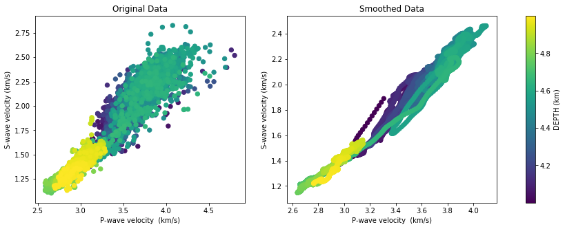
I strongly suggest to use smoothed logs for visual interpretation only and use the original data for numerical computations. As an example, look at the crossplot between P- and S-wave velocities using the original data and the smoothed data.
# replace the anomalous values from the density curve and replace them with the average value

logs['RHOM_filt'] = logs['RHOM'].replace(logs[logs['RHOM'] < 2]['RHOM'], logs['RHOM'].mean())
# Moving average to smooth logs (baseon on convolution)

def smooth(data, window_len=10):
    """Smooth the data using a window with requested size."""
    s_p = np.r_[2*data[0]-data[window_len:1:-1],
                data, 2*data[-1]-data[-1:-window_len:-1]]
    w_p = np.ones(window_len, 'd')
    y_p = np.convolve(w_p/w_p.sum(), s_p, mode='same')
    return y_p[window_len-1:-window_len+1]
# Smoothing curves
RHOM_smooth = smooth(logs['RHOM_filt'].values, window_len=50)
GR_smooth = smooth(logs['GR'].values, window_len=50)
SPHI_smooth = smooth(logs['SPHI'].values, window_len=50)
ATCO90_smooth = smooth(logs['ATCO90'].values, window_len=50)
GR_smooth = smooth(logs['GR'].values, window_len=50)
DTCO_smooth = smooth(logs['DTCO'].values, window_len=50)
DTSM_smooth = smooth(logs['DTSM'].values, window_len=50)

#Converting depths to km
DEPTH = logs['DEPTH']/1000
RHOM_f = logs['RHOM_filt']
f, (ax1, ax2, ax3, ax4, ax5) = plt.subplots(1, 5, sharey=True, figsize=(17, 15))
f.subplots_adjust(wspace=0.02)
plt.gca().invert_yaxis()

# So that y-tick labels appear on left and right
plt.tick_params(labelright=True)

# Change tick-label globally
mpl.rcParams['xtick.labelsize'] = 10

# Track 1: Gamma Ray
ax1.plot(logs['GR'], DEPTH,'c', linewidth=0.3)
ax1.plot(GR_smooth, DEPTH,'c')
ax1.xaxis.tick_top()
ax1.xaxis.set_label_position('top')
ax1.set_xlabel('GR (API)')
ax1.set_ylabel('DEPTH (km)')

plt.setp(ax1.get_xticklabels()[1::2], visible=False)  # Hide every second tick-label
remove_last(ax1)  # remove last value of x-ticks, see function defined in first cell

# Track 2: Bulk Density
ax2.plot(logs['RHOM_filt'], DEPTH, 'orange', linewidth=0.3)
ax2.plot(RHOM_smooth, DEPTH, 'orange')
ax2.set_xlabel('RHOM (g/cm3)',va = 'top')
ax2.xaxis.tick_top()
ax2.xaxis.set_label_position('top')
remove_last(ax2)

# Track 3: Sonic Porosity
ax3.plot(logs['SPHI'], DEPTH, 'k', linewidth=0.3)
ax3.plot(SPHI_smooth, DEPTH, 'k')
#ax3.set_xlim(-.1, 1)
ax3.set_xlabel('SPHI (v/v)')
ax3.xaxis.tick_top()
ax3.xaxis.set_label_position('top')
remove_last(ax3)

# Track 4: Resistivity
ax4.plot(logs['ATCO90'], DEPTH, 'g',linewidth=0.3)
ax4.plot(ATCO90_smooth, DEPTH, 'g')
ax4.set_xlabel('Resistivity (Ohm.m)')
ax4.set_xscale('log')
ax4.xaxis.tick_top()
ax4.xaxis.set_label_position('top')
# remove_last: That trick does not work for log-scale, see next plot

# Track 5: Sonic (velocities)
ax5.plot(logs['DTCO'], DEPTH, 'r',label='DTCO',linewidth=0.3)
ax5.plot(logs['DTSM'], DEPTH, 'b',label='DTSM',linewidth=0.3)
ax5.plot(DTCO_smooth, DEPTH, 'r',label='DTCO')
ax5.plot(DTSM_smooth, DEPTH, 'b',label='DTSM')
ax5.set_xlabel('Traveltime (us/ft)')
ax5.xaxis.tick_top()
ax5.legend(loc='best')
ax5.xaxis.set_label_position('top')
remove_last(ax5, 'both')  # because it does not work above, we remove here on both sides


plt.show()

#f.savefig('raw_well-logs_plot.png', format='png', dpi=200)
Visual data exploration: interpreting data
This is usually the job of a petrophysicist, to interpret well logs and process them to compute physical properties based on rock models o relationships. However, as seismimologists, it is important to understand the geological environment we work on, if there are fast or slow lithology changes, identify which properties were measured and which were mathemathically derived and under which premises. We are not replacing the petrophysicist, we are being analytical.
NOTE: Analysis and intepretation of well logs are beyond the scope of this notebook. But have at hand your hard copy of Geological Interpretation of Well Logs by H.R. Bilder or take a look to the official online resources from your favorite professional association, such as the AAPG Well log analysis for reservoir characterization.
Lithological changes
Gamma Ray log is an indicator of lithology. The curve shows a zig-zag behavior between 4 - 4.6 km depth in the same value range, which suggests this is a sequence of shale-sand alternating layers. Beyond depth 4.65 km, approximately, there is a strong increase towards more suggesting a distictive lithology change, which even more noticeable in the resistivity and sonic logs.
Here, it is important to know (from reading the information in the header) or to identify which logs have been derived and which ones measured to not over interpret. Sonic logs are generally measured and many properties derived from them. For example, the curve SPHI is an acronym for Porosity (PHI) derived from the (S)onic log by using a transformation rule called Wyllie equation.
Resistivity logs are also measured because they key in identifying oil & gas accumulations, shown as a strong possitive value. But it is also sensitive to lithology.
About the density (RHO) log, remains unclear whether it is a measured or a computed log.
From now on, our analysis focuses on the sonic log because velocities are the properties that build a link between seismic images and rock properties.
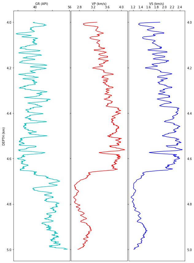
Velocity analysis
Both DTCO and DTSM logs are measurements of the travel time of compresional and shear waves, respectively. Thus, they have to be converted to velocity (VP, VS) values as shown below.
Simply put, rocks a greater depths are more compacted due to the load above them. Thus, the speed at which acoustic waves travel through rocks in the subsurface show, generally, a linear porsitive trend: larger velocities at grater depths. In this example, the lithological change indicated by gamma ray is strongly linked to a deflection in the velocity measurements. Moreover, this deflection shows a strong reduction of velocities a greater depths, which suggests an anomalous pressure regime maybe caused by the presence of light fluids (e.g. gas) or lighther rocks (e.g. salt). We are not going into detail i this notebook to find out the causes of this velocity change.
VP = (1000/logs.DTCO)*0.3048
VS = (1000/logs.DTSM)*0.3048
VP_smooth = (1000/DTCO_smooth)*0.3048
VS_smooth = (1000/DTSM_smooth)*0.3048
f, (ax1, ax2, ax3) = plt.subplots(1, 3, sharey=True, figsize=(10, 15))
f.subplots_adjust(wspace=0.02)
plt.gca().invert_yaxis()

# So that y-tick labels appear on left and right
plt.tick_params(labelright=True)

# Change tick-label globally
mpl.rcParams['xtick.labelsize'] = 10

# Track 1: Gamma Ray
ax1.plot(GR_smooth, DEPTH,'c')
ax1.xaxis.tick_top()
ax1.xaxis.set_label_position('top')
ax1.set_xlabel('GR (API)')
ax1.set_ylabel('DEPTH (km)')

plt.setp(ax1.get_xticklabels()[1::2], visible=False)  # Hide every second tick-label
remove_last(ax1)  # remove last value of x-ticks, see function defined in first cell

# Track 2: Sonic (velocities)
ax2.plot(VP_smooth, DEPTH, 'r')
ax2.set_xlabel('VP (km/s)')
ax2.xaxis.tick_top()
ax2.xaxis.set_label_position('top')
remove_last(ax2, 'both')

# Track 3: Sonic (velocities)
ax3.plot(VS_smooth, DEPTH, 'b')
ax3.set_xlabel('VS (km/s)')
ax3.xaxis.tick_top()
ax3.xaxis.set_label_position('top')
remove_last(ax3, 'both')# because it does not work above, we remove here on both sides

plt.show()

#f.savefig('raw_well-logs_plot.png', format='png', dpi=200)
It is useful to plot velocities against each other. This way we can identify if S-wave velocity has been measured or computed from P-wave velocity. We can see the distribution of the velocity measurements without any processing on the right, and the smoothed values on the left. Notice that the convolutional filter has changed the statistical nature of data and that it looks like synthetic data. Colors indicate the depth of each measurement, as we have identified a lithological change around 4.6 km, this is a way to check it out.
We can distringuish by eye inspection that there are two clear, mostly linear trends:
- bright green and yellow points are less scattered, grouped at the lowest velocity values and greater depths
- dark green and purple points are much more scattered, with larger velocity values, shallower depths, and a trend slightly steeper
Insights from this croos-plot tell us that it will interesting to conduct two separate analysis for each trend, since rock proerties (or elastic moduli) are going to be computed.
f, (ax1, ax2) = plt.subplots(1, 2, figsize=(15, 5))
#f.subplots_adjust(wspace=0.02)

ax1.scatter(VP,VS,40, c=DEPTH)
ax1.set_xlabel('P-wave velocity  (km/s)')
ax1.set_ylabel('S-wave velocity (km/s)')
ax1.set_title('Original Data')


cm = ax2.scatter(VP_smooth,VS_smooth,40, c=DEPTH)
ax2.set_xlabel('P-wave velocity  (km/s)')
ax2. set_ylabel('S-wave velocity (km/s)')
ax2.set_title('Smoothed Data')

cb = f.colorbar(cm, ax=[ax1, ax2])
cb.set_label('DEPTH (km)')

plt.show()

#plt.savefig('VP_VS.png', format='png', dpi=200)
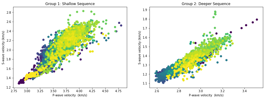
Below, we plot separately both groups we have identified as a shallow rock sequene and a deeper one.
#This is where the inflection point is located
i = 4395

f, (ax1, ax2) = plt.subplots(1, 2, figsize=(15, 5))
#f.subplots_adjust(wspace=0.02)

ax1.scatter(VP[:i],VS[:i],40, c=DEPTH[:i])
ax1.set_xlabel('P-wave velocity  (km/s)')
ax1.set_ylabel('S-wave velocity (km/s)')
ax1.set_title('Group 1: Shallow Sequence')

ax2.scatter(VP[i+1:],VS[i+1:],40, c=DEPTH[i+1:])
ax2.set_xlabel('P-wave velocity  (km/s)')
ax2. set_ylabel('S-wave velocity (km/s)')
ax2.set_title('Group 2: Deeper Sequence')

plt.show()

#plt.savefig('groups.png', format='png', dpi=200)
Incompressibility and Shear
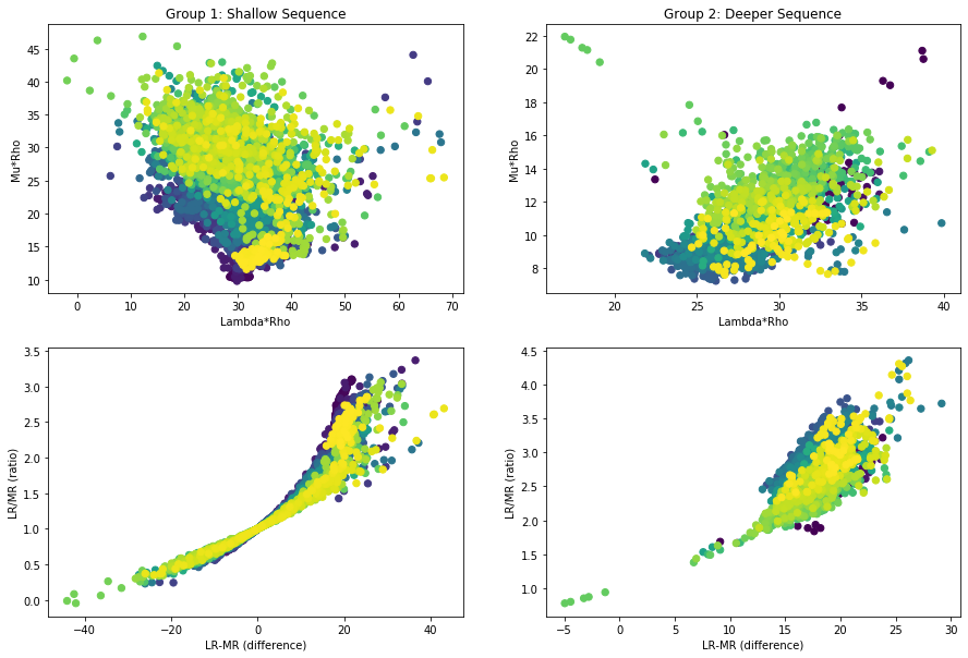
There is a technique to compute elastic moduli from sonic and density logs. Take a look at this case study where this technique was applied to identify gas accumulations in Terciary clastic sequences.
In summary, impedances are derived as the product of velocity and density. Then, two attributes are computed, also known as Lame parameters weighted by:
- LambdaRho: associated with the (inverse) of compresibility
- MhuRho: Associated with shear
#Computing impedances
IP = VP * RHOM_f
IS = VS * RHOM_f

#Computing LambdaRho and MuRho attributes
LR = IP**2 - 2*IS**2
MR = IS**2

#Deriving more attributes
LRMR_d = LR - MR   # difference
LRMR_r = LR / MR   # ratio
#Plotting data

f, axs = plt.subplots(2, 2, figsize=(15, 10))
#f.subplots_adjust(wspace=0.02)

axs[0,0].scatter(LR[:i],MR[:i],40, c=DEPTH[:i])
axs[0,0].set_xlabel('Lambda*Rho')
axs[0,0].set_ylabel('Mu*Rho')
axs[0,0].set_title('Group 1: Shallow Sequence')

axs[0,1].scatter(LR[i+1:],MR[i+1:],40, c=DEPTH[i+1:])
axs[0,1].set_xlabel('Lambda*Rho')
axs[0,1]. set_ylabel('Mu*Rho')
axs[0,1].set_title('Group 2: Deeper Sequence')

axs[1,0].scatter(LRMR_d[:i],LRMR_r[:i],40, c=DEPTH[:i])
axs[1,0].set_xlabel('LR-MR (difference)')
axs[1,0].set_ylabel('LR/MR (ratio)')

axs[1,1].scatter(LRMR_d[i+1:],LRMR_r[i+1:],40, c=DEPTH[i+1:])
axs[1,1].set_xlabel('LR-MR (difference)')
axs[1,1].set_ylabel('LR/MR (ratio)')

plt.show()
#plt.savefig('LambdaRho_vs_MuRho.png', format='png', dpi=200)
#plt.savefig('LRMR_attr.png', format='png', dpi=200)
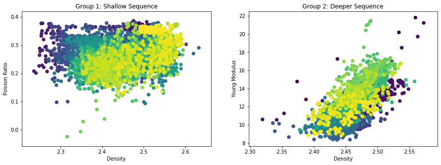
#Poisson Ratio
poisson = 0.5*(((VP/VS)**2 - 2 ) / ((VP/VS)**2 - 1))
#Young modulus
E = ((2*MR) * (1 + poisson)) / RHOM_f
f, (ax1, ax2) = plt.subplots(1, 2, figsize=(15, 5))
#f.subplots_adjust(wspace=0.02)

ax1.scatter(RHOM_f[:i], poisson[:i],40, c=DEPTH[:i])
ax1.set_xlabel('Density')
ax1.set_ylabel('Poisson Ratio')
ax1.set_title('Group 1: Shallow Sequence')

ax2.scatter(RHOM_f[i+1:], E[i+1:],40, c=DEPTH[i+1:])
ax2.set_xlabel('Density')
ax2.set_ylabel('Young Modulus')
ax2.set_title('Group 2: Deeper Sequence')

plt.show()

#plt.savefig('Poisson_vs_Young.png', format='png', dpi=200)